The Magical Moving Font
In 2017 Odysseas Galinos Paparounis, a designer from Athens, launched a crowdfunding campaign on Indigogo through his company Høly, for a new font design named ‘Futuracha Pro’.
He was just one of hundreds of designers looking for investment at the time, but what made this quirky font really special was that it could magically re-adjust as you write, based on the preceding and following letters.
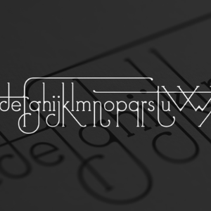
The font had an eye-catching, whimsical look, with art-nouveau-like swirls, simple narrow serifs, long descenders and stretched stems. All of which could change the moment the next letter was typed.
It was a design inspired by cockroaches.
Paparounis became fascinated with the insects’ curled antennae and thick, prickly legs whilst studying them for an illustration project. These features inspired the organic aesthetic of Futuracha Pro, and its name, a combination of “Futura” and “cucaracha” (cockroach).
The font was an instant hit. By the end of the campaign, Futuracha Pro had attracted over 3000 investors and raised over £66,300 (2160% of its original target), making it the most successful crowd-funded font in history.
But then the problems started.
Høly were under pressure to deliver on their promises, but Paparounis’s first .otf file, launched in 2017, highlighted weaknesses in the concept.
Letters were overlapping. Words lost their balance. The extravagant design of the characters – which was a huge part of the appeal – called for constant manual spacing corrections.
With the promise of an upcoming version, Paparounis set to work on a complete re-design and began ‘reprogramming the font’s DNA.’
Unfortunately, this process was not simple. With so much to untangle, the intended release dates came and went. As months turned to years the eager Futuracha supporters became less patient.
Comments and questions piled up in Høly’s inbox:
“Still waiting on my copy of the font. What’s going on guys?”
“It’s been over a year. Is there any chance we get the product we were promised?”
“Holy, could we please have an update, at least? Bad news is better than no news. Tell us you’re working on it. Tell us you’ve given up. Just tell us something.”
“What the frak people?”
It seemed the Futuracha update would never see the light of day.
And then at last, in mid-2019, Paparounis issued a statement.
Finally, the long-awaited update was released.
The cockroach-inspired, organic elements had been refined and improved. Serifs were bolder, and the curves smoother, bringing a natural weight and balance to the letters.
Capital letters were finally included, as were quirky numbers, glyphs and diacritics.
Every character had between three and seven alternatives which would change depending on their position. There were four ‘position alternates’ programmed: Isolated, Initial, Medial and Final. There were also four ‘stylistic sets’ designed, offering different overall designs for combinations of words.
The kinks were gone. The magical moving font worked.
And there was one final change: the name.
Despite Futuracha Pro being Høly’s most well-know product, the team made the unusual decision to rename it:
Decoracha.
As Paparounis explained; “Decoracha is not only claiming the unique character that the new font needed, directly attached to its art deco roots, but also helps it start a brand new journey, as an exclusively decorative – and no longer futuristic – font.”
In its first year, Futuracha Pro was downloaded 50,000 times, despite the teething issues. Now Decoracha proves to be even more popular and the comments from supporters are positive once more:
“I have not seen anything this beautiful in a mighty long time. Stunning work, one of the most gorgeous typefaces out there.”
“What a jaw-dropping gorgeous font. I’m in full awe!!!!”
“Høly cow!”
But was it worth the wait? Perhaps you should take a look and decide for yourself…
View the Decoracha Promo Video >
Get the Font >
For more on Typography from The Book Collector, take a look at Nicolas Barker’s article on Typography and Design from our Winter 2001 issue.